
How to Run a UX Audit Website Owners Can Actually Use
September 24, 2026
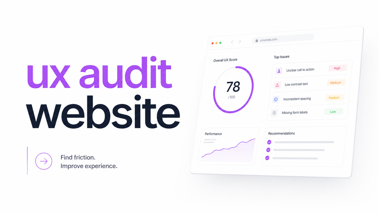
Most websites underperform not because of one bad button color, but because nobody diagnosed the actual problem before trying to fix it. A UX audit website review is that diagnosis — a structured way to find out why visitors leave, get confused, or fail to convert, before you spend an hour on redesign work.
This guide skips the 40-point checklist. Instead, you get a five-step process, a way to score what you find, and a clear answer to the question everyone eventually asks: should you do this manually, hire an agency, or run it through a tool?
What a UX Audit Actually Is (and Isn't)
A UX audit is a systematic review of how real users experience your site — where they get stuck, what confuses them, and which friction points cost you conversions. It's not a redesign; the audit is diagnosis, the redesign is treatment. Skipping straight to redesign without an audit is like prescribing medication before running any tests.
It's also not the same as a pure accessibility audit or an SEO audit, though they overlap. A website UX audit looks at navigation clarity, form friction, visual hierarchy, and page performance together, because users experience all of them at once. Accessibility checks against WCAG guidelines are one input into that picture, not the whole picture.
In practice, a UX audit answers "why isn't this page converting," backed by evidence — heuristic evaluation, behavioral data, and technical checks — rather than opinion about what "feels off."
The 5-Step UX Audit Process
Here's how to do a UX audit without drowning in checklist items. Each step has a clear job.
1. Define the problem and the KPI. Before touching the site, name what's broken: high bounce rate on the homepage, low checkout completion, poor mobile engagement. Every finding later gets judged against this KPI — if it doesn't move the needle, it's not a priority.
2. Map user flows and navigation. Walk the primary paths a visitor takes — homepage to product, product to cart, cart to checkout. Check menu labeling, breadcrumb clarity, click depth to key pages, and whether the information architecture matches how users actually think, a core theme of Jakob Nielsen's usability heuristics.
3. Find friction points in forms and drop-off zones. Long forms, unclear error states, and unnecessary required fields are conversion killers. Cross-reference this step with heatmaps and session recordings to see exactly where users hesitate or abandon — this is where quantitative audit steps meet qualitative behavior data, covered in more depth in Analytics for UX: Turning Behavior Data Into Fixes.
4. Check visual hierarchy and accessibility. Confirm the most important action on each page is visually dominant, contrast ratios meet WCAG standards, and interactive elements are keyboard-navigable. Baymard Institute's research consistently shows that unclear visual priority is a top reason users miss calls to action entirely.
5. Verify performance and technical health. Slow load times and unstable layouts undo good UX design. Check Core Web Vitals, mobile load speed, and broken links or redirect chains — a full site crawl is the fastest way to surface these technical issues across an entire site rather than page by page.
That's the full audit process: five checks, each producing findings you can score and rank.
Manual Review vs. Automated UX Audit Tools
Manual heuristic evaluation — an expert walking through your site against Nielsen's heuristics and their own experience — is valuable when a site is complex, highly custom, or when subtle brand and content judgment matters. A skilled auditor catches nuance that rules-based systems miss.
But manual review is slow. Agencies often take one to three weeks to deliver a full audit report, and the findings are only as consistent as the person writing them. That's where an automated UX audit earns its place. An AI UX audit tool scans navigation structure, form friction, contrast and accessibility flags, and Core Web Vitals in minutes, applying the same criteria every time — no reviewer fatigue, no inconsistency between audits.
This is precisely the gap Optimevra fills: instead of waiting on an agency calendar, you get a prioritized list of UX, accessibility, and performance issues almost immediately. It doesn't replace judgment on brand voice or complex user research, but for the mechanical parts of a UX audit — the parts that eat the most time — an automated tool gets you 80% of the way there before a human ever opens the site. See how it works with a live demo.
Turning Findings Into Fixes: How to Prioritize
A UX audit report full of unranked findings is almost as useless as no audit at all. Score every issue on two axes: severity and estimated conversion impact.
- Critical: Blocks conversion or excludes users entirely — a broken checkout button, a form that fails on mobile, an inaccessible primary CTA.
- Major: Adds friction but doesn't block the path — confusing navigation labels, weak visual hierarchy on a landing page, slow load on a key template.
- Minor: Polish issues — inconsistent spacing, secondary copy clarity, non-critical contrast tweaks.
Pair each severity tier with a rough estimate of how many users or how much revenue it touches. A critical issue on your highest-traffic landing page outranks a major issue on a rarely visited support page, regardless of how "bad" either looks on paper. This is how you prioritize UX fixes with data instead of whoever argues loudest in the stakeholder meeting — the difference between a report people act on and one that sits in a shared drive.
What Results to Expect
Fixing root-cause UX friction — not just cosmetic tweaks — routinely produces conversion rate lifts in the range organizations report after addressing checkout friction, form abandonment, and navigation confusion identified through structured CRO and UX audit work. The exact ROI depends on your baseline: a site with severe checkout friction will see a bigger jump than one that's already reasonably optimized.
The realistic expectation isn't an overnight doubling of revenue. It's a measurable, compounding improvement in conversion rate as critical and major issues get resolved in order, validated against the KPI you defined in step one. Track the same metric before and after each fix batch so you can prove impact rather than assume it — that's what turns a UX audit conversion rate improvement into a defensible business case rather than a hunch.
Frequently Asked Questions
How long does a UX audit of a website take?
A manual agency-led audit typically takes one to three weeks depending on site size and scope. An automated tool like Optimevra can surface navigation, friction, and accessibility flags in minutes, though a full report combining automated scans with human review of complex flows may still take a few days.
What's the difference between a UX audit and an accessibility audit?
An accessibility audit checks compliance against standards like WCAG — contrast, keyboard navigation, screen reader support. A UX audit is broader: it includes accessibility but also covers navigation, form friction, visual hierarchy, and performance as they affect overall usability and conversion.
Can I run a UX audit myself without hiring an agency?
Yes, using the five-step framework — define your KPI, map flows, find friction, check hierarchy and accessibility, verify performance. Pairing manual heuristic evaluation with an automated tool covers most of what an agency would deliver, at a fraction of the time and cost.
How much can a UX audit actually improve conversion rate?
The improvement depends entirely on your starting point — sites with severe checkout or form friction typically see larger gains than already-optimized sites. The reliable approach is tracking your defined KPI before and after fixes rather than expecting a fixed percentage.
What tools do you need to do a UX audit?
At minimum, you need analytics for KPI tracking, heatmaps or session recordings for behavioral evidence, and a Core Web Vitals checker for performance. An AI-powered platform like Optimevra combines navigation, accessibility, and performance scanning into a single automated pass.
How often should you audit your website's UX?
Run a full audit after any major redesign or traffic shift, and a lighter check quarterly for active sites. Automated tools make frequent re-audits practical, since they don't carry the time cost of a full manual review each time.
Manually mapping flows, checking forms, and hunting for accessibility flags can take days you don't have. Optimevra runs those first three audit steps — navigation, friction points, and accessibility flags — in minutes through its automated scan. Try the live demo to see your own site's findings, or check pricing if you want ongoing monitoring instead of a one-time check.
Originally published on Rankevra.