
Meta Tag Viewport: Correct Syntax & Accessibility Fixes
August 15, 2026
What Is the Meta Tag Viewport?
The viewport meta tag is a line of HTML in a page's that tells mobile browsers how to scale and render content. Without it, phones and tablets assume your page was built for a desktop screen — typically 980px wide — and shrink the layout to fit, forcing visitors to pinch-zoom just to read a sentence or tap a button.
"Viewport" simply means the visible area of a web page in the browser window. On desktop, that area roughly matches the browser window itself. On mobile, the physical screen is much narrower than the CSS layout most sites are designed around, so the browser needs explicit instructions on how to reconcile the two. That instruction is exactly what this tag provides — and it's foundational to responsive web design, which relies on the browser reporting an accurate viewport width before any CSS media query can respond to it.
Skip the tag, and you get the classic symptom of an un-optimized mobile site: tiny text, a page that renders full desktop-width, and a permanent horizontal scrollbar. It's one of the first things Google's Mobile Usability report in Search Console flags, and one of the first things any competent audit checks.
The Correct Syntax (Copy-Paste Example)
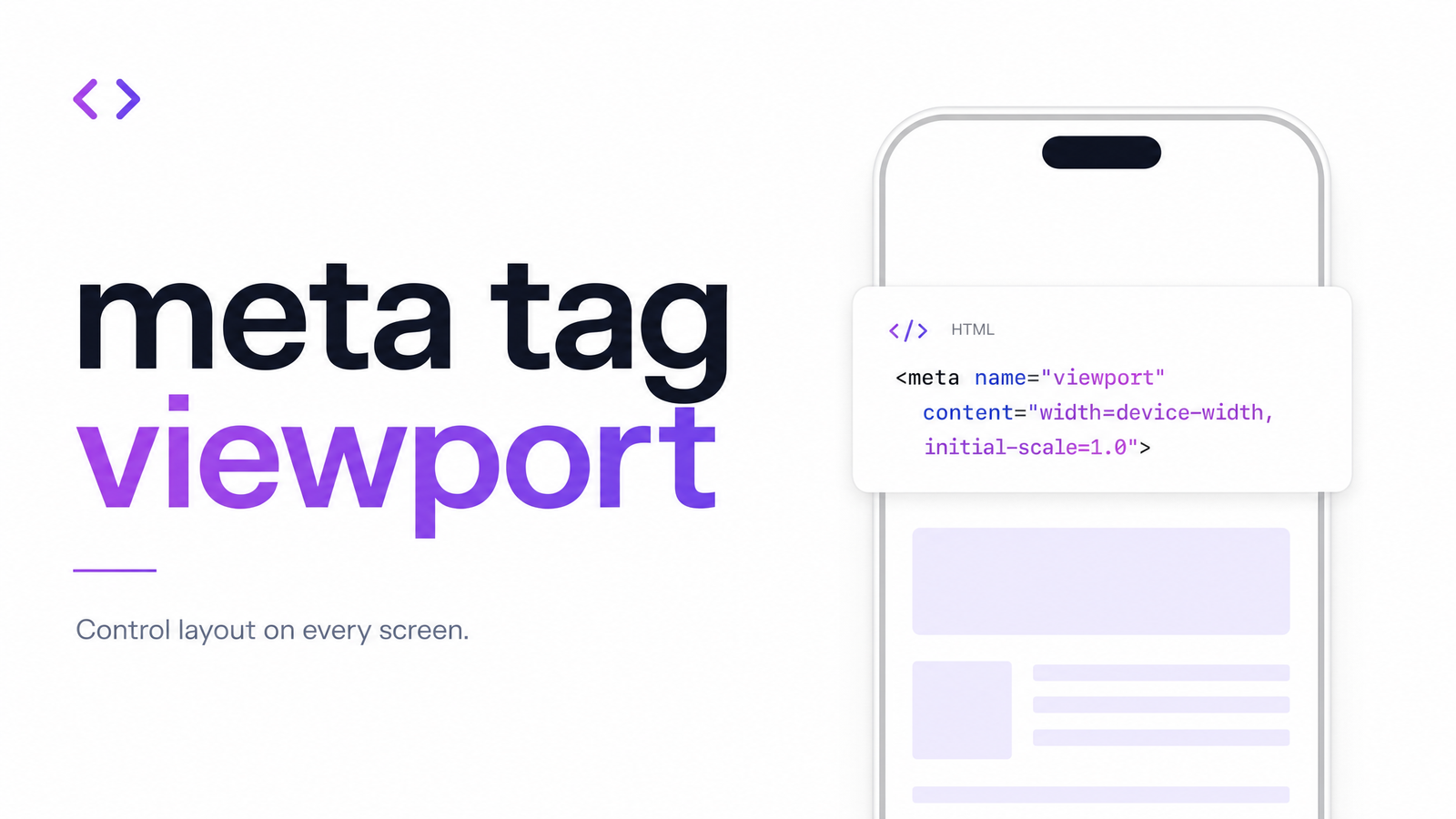
There's really only one viewport meta tag configuration that's safe for the overwhelming majority of sites:
Paste that into your , and here's what each piece is doing:
width=device-width— sets the layout viewport's width to match the device's actual screen width in CSS pixels, rather than defaulting to a fixed desktop-style value. This is what allows your CSS media queries to actually respond to phone and tablet screen sizes.initial-scale=1— sets the initial zoom level when the page first loads, establishing a 1:1 relationship between CSS pixels and device-independent pixels. Without it, some mobile browsers apply their own default zoom, which can vary by device.
Desktop browsers ignore this tag entirely, so you can add or fix it with no risk of breaking your desktop layout.
If your site uses notched or edge-to-edge displays, you may also see viewport-fit=cover appended, which lets content extend into safe areas on devices like recent iPhones. It's optional and only relevant for specific full-bleed layouts — it doesn't replace the two core properties above.
Common Mistakes That Break Mobile UX or Accessibility
Most viewport problems flagged in audits aren't a missing tag — they're a tag someone configured to intentionally disable zooming, usually years ago, back when "locking" the viewport was considered a way to make web apps feel more native. That advice has since become an accessibility liability. Here are the specific mistakes to look for:
user-scalable=no — This disables pinch-to-zoom entirely. It was once common for sites trying to mimic native app behavior, but it strips out a critical accessibility feature for low-vision users who rely on zoom to read content. This is a direct WCAG 1.4.4 Resize Text failure at Level AA.
maximum-scale=1 (or any value under 2) — Functionally similar to user-scalable=no. Even if zoom isn't fully disabled, capping it at 1x or slightly above prevents users from resizing text up to the 200% that WCAG 1.4.4 requires be possible without loss of content or functionality.
Fixed pixel widths (width=600, for example) — Instead of device-width, some legacy tags hardcode a specific pixel width. This breaks responsive layouts across different screen sizes, causing horizontal scrolling, cut-off content, and layout shifts that have nothing to do with your actual CSS.
Missing the tag entirely — The page renders at desktop width and gets scaled down uniformly, making text unreadably small until the user zooms in manually — assuming zoom hasn't also been disabled somewhere else in the stack.
Each of these mistakes has a distinct signature in an audit report, but they all trace back to the same root cause: a tag written to control layout without accounting for how real users, including those with disabilities, actually interact with a page.
Why This One Tag Affects SEO, Accessibility, and Conversions at Once
Few single lines of markup touch this many outcomes simultaneously. On the SEO side, viewport configuration is a core input to Google's mobile usability ranking signal — misconfigured or missing tags get surfaced directly in Search Console's Mobile Usability report, and mobile-friendliness has been a ranking factor since Google moved to mobile-first indexing.
On the compliance side, a locked or restricted viewport is a textbook WCAG 1.4.4 Level AA violation, and organizations subject to Section 508 or ADA-related web accessibility obligations can be flagged for exactly this kind of markup during an audit or legal review.
And on the conversion side, the cost is more immediate: a user who can't zoom in to read your pricing table, or who hits a horizontal scrollbar trying to tap your "Add to Cart" button, simply leaves. Viewport accessibility isn't a checkbox exercise — it's the difference between someone completing a purchase and bouncing.
This is a good example of why small markup-level details rarely stay isolated to one discipline. The same pattern shows up in other technical fundamentals — see how indexability issues compound in a similar way, quietly undermining SEO through a single overlooked tag or directive.
How to Check Your Viewport Tag Is Set Up Correctly
You don't need specialized tools to do a first-pass check:
- View page source or open DevTools and search for
name="viewport"in the. Confirm the tag exists at all. - Read the content attribute carefully. Look for
user-scalable=no, anymaximum-scalevalue below 2, or a hardcoded pixel width instead ofdevice-width. - Test pinch-to-zoom on a real mobile device. Load the live page and try to zoom in with two fingers. If nothing happens, zoom is disabled somewhere — whether in this tag or elsewhere in your CSS/JS stack.
- Check Search Console's Mobile Usability report for flags like "text too small to read" or "content wider than screen," both of which point straight back to viewport configuration.
Manually checking one tag on one page is manageable. Checking it across every template, landing page, and legacy page on a site — plus the dozens of other markup-level issues that hide alongside it — is where a full audit tool earns its keep.
Run a Full Check, Not Just a Manual One
The viewport tag is one of dozens of small, easy-to-miss markup issues — alongside broken indexability signals, redirect chains, and broken links — that quietly erode mobile rankings and accessibility compliance without ever throwing a visible error on the page. Most site owners only discover them after a ranking drop or an accessibility complaint.
Optimevra scans your site automatically and flags exactly this kind of issue alongside the rest of your technical and UX health. Try the live demo to see what it catches on your own pages, or check pricing if you're ready to put it to work across your whole site.
Frequently Asked Questions
Is the viewport meta tag necessary if I already use responsive CSS?
Yes — responsive CSS media queries depend on the browser reporting an accurate viewport width, and the meta tag is what sets that width in the first place. Without it, mobile browsers default to a desktop-style viewport, so your media query breakpoints may never trigger as intended, regardless of how well-built your CSS is.
Does Google penalize sites for a missing or misconfigured viewport tag?
Google doesn't issue a direct "penalty," but mobile usability is a ranking signal, and a missing or broken viewport tag causes issues like tiny text and horizontal scrolling that Search Console flags under Mobile Usability. Since Google uses mobile-first indexing, a poor mobile experience can meaningfully suppress rankings even without a formal penalty.
What's the difference between user-scalable=no and maximum-scale=1?
user-scalable=no disables pinch-to-zoom entirely, while maximum-scale=1 allows zooming but caps it at the page's initial scale, which in practice prevents any meaningful zoom-in. Both fail WCAG 1.4.4 because neither allows users to resize text up to 200%.
Can I use the viewport meta tag to control desktop layout too?
No — desktop browsers ignore the viewport meta tag entirely, so it has no effect on desktop rendering. Desktop layout is controlled purely by your CSS and the browser window's actual dimensions.
How do I check what viewport tag a competitor's site is using?
View their page source or open browser DevTools and search for name="viewport" in the section — the full tag and its attributes will be visible in the raw HTML. This works on any public site since the tag isn't hidden or obfuscated.
Does disabling zoom actually violate an accessibility law, or just a guideline?
It depends on jurisdiction and context, but disabling zoom directly fails WCAG 1.4.4 Resize Text at Level AA, which is the standard referenced by Section 508 and most ADA-related web accessibility requirements in the U.S. In practice, this makes it a legal risk for organizations covered by those regulations, not merely a best-practice suggestion.
Originally published on Rankevra.