
Meta Tag for Viewport: Correct Syntax & Common Mistakes
September 22, 2026
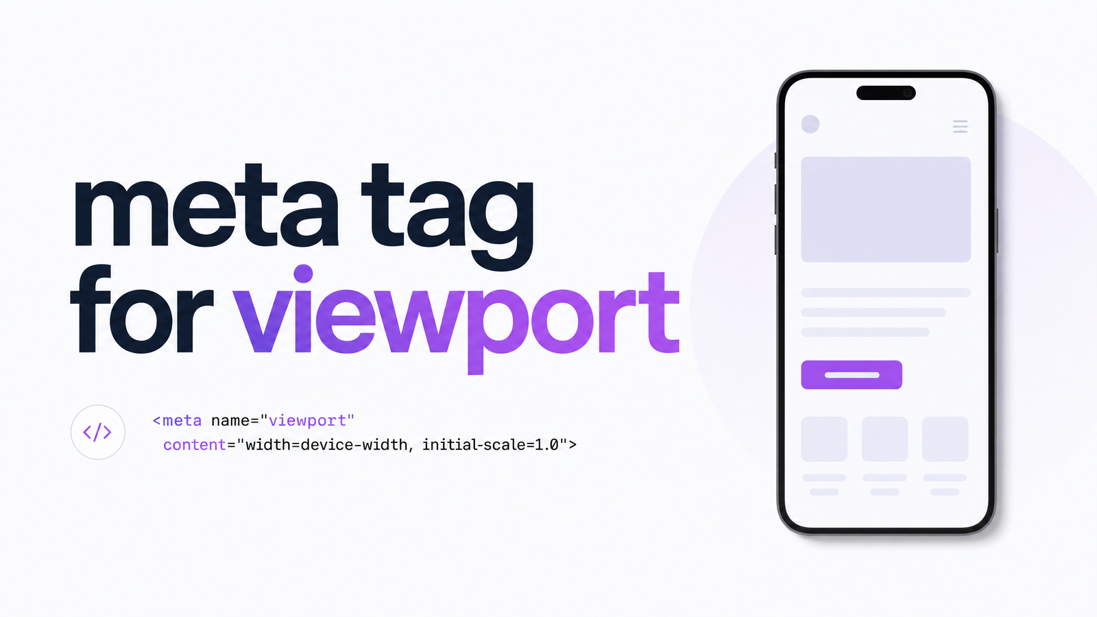
What Is the Viewport Meta Tag?
The viewport meta tag is a single HTML element placed in a page's that tells mobile browsers how to size and scale the content. Without it, phones and tablets assume your site was built for a desktop screen and render it at a fixed 980px width, then shrink the whole page to fit the device — producing illegibly small text and controls that users must pinch and drag to read.
This tag overrides that 980px fallback and tells the browser to match the page's width to the device's actual screen width, at a sensible starting zoom level. It's not decorative markup — it's the switch that turns a desktop layout into a responsive one. Every framework, CSS media query, and responsive grid you build depends on this tag being present and correct; without it, your responsive CSS won't behave as expected on a phone.
The Correct Viewport Meta Tag Syntax
The standard, copy-paste-safe version that works for the vast majority of sites is:
Two attributes do the real work here. width=device-width sets the viewport's width to match the device's screen width in CSS pixels, instead of the 980px desktop default. initial-scale=1 sets the initial zoom level to 1:1 when the page first loads, so nothing appears artificially zoomed in or out.
This tag belongs inside the of every HTML document — ideally near the top, alongside your charset declaration and title tag, before any stylesheets load. If a viewport meta tag isn't working as expected, check that it's actually present in the rendered HTML (not just your template source) and that no other script or plugin is injecting a conflicting second viewport tag later in the document. Browsers only honor the first one they parse, and CMS themes or ad scripts sometimes add their own.
For the full, authoritative attribute reference — including less common properties like minimum-scale and viewport-fit — see MDN's viewport meta tag documentation.
Common Mistakes That Break It
Three failure patterns account for almost every real-world viewport problem.
Missing tag entirely. Some older templates, hand-rolled HTML, or CMS themes never included one. The page falls back to 980px desktop rendering on every mobile device, and mobile-friendly tests flag it immediately.
Hardcoded pixel width. Writing content="width=1024" instead of width=device-width locks the viewport to a fixed size regardless of the actual screen. It might look fine on the one device you tested and break on everything else — a tag that's present but still wrong.
Disabling zoom. This is the mistake that matters most and gets discussed least. Many older tutorials add user-scalable=no or maximum-scale=1 to stop users from accidentally pinch-zooming a design. It feels like a polish decision, but it's an accessibility failure. Blocking zoom prevents low-vision users from magnifying text, directly violating WCAG 1.4.4 Resize Text, which requires content to be resizable up to 200% without loss of functionality. Deque University's axe rule for meta viewport flags user-scalable=no and restrictive maximum-scale values as automatic failures — modern mobile browsers largely ignore these directives now anyway, so they no longer reliably prevent zoom; they just signal outdated, non-compliant code. user-scalable=no isn't just an SEO issue — it's a legal accessibility risk that also correlates with worse mobile usability signals.
Why It Matters for SEO and Accessibility
Google evaluates pages primarily through mobile-first indexing, meaning the mobile version of your page — not the desktop version — is what gets crawled, rendered, and ranked. A missing or broken viewport tag causes Google's rendering engine to see the same tiny-text, wrong-width page a human would see on their phone, undermining mobile-friendliness signals and dragging down how Core Web Vitals are measured, since those metrics are captured against the mobile viewport in most real-world (CrUX) data. Lighthouse explicitly checks for a valid viewport meta tag as part of its mobile usability audit, and its absence is one of the most common causes of a failing mobile score.
The accessibility angle runs in parallel, not separately. WCAG 1.4.4 compliance and Google's mobile usability checks both reward the same correct configuration and both penalize the same zoom-blocking mistake. A single line of markup simultaneously affects how your page renders, whether it passes an accessibility audit, and how it's evaluated for ranking — there's no version of "good SEO" that includes disabling zoom. Tools like axe DevTools and Lighthouse will both surface this as a fail, and for good reason.
How to Check Your Viewport Tag Site-Wide
Checking one page is trivial: open DevTools, inspect the , confirm the tag reads width=device-width, initial-scale=1, and move on. The problem is that most sites aren't one page. Agencies manage dozens of client sites, marketers run landing pages built in a page builder separate from the main CMS template, and developers ship multiple templates (blog post, product page, category page, custom landing pages) that may not share the same header include. A viewport tag can be correct on your homepage and missing or broken on twenty other URL patterns you never manually checked.
This is exactly the kind of issue a manual, page-by-page review misses and an automated, site-wide audit catches. Optimevra crawls your entire site and flags every page where the viewport tag is missing, misconfigured, or disabling zoom — alongside other rendering, performance, and accessibility issues that affect the same pages. Instead of spot-checking a handful of URLs and hoping the rest of your templates are consistent, you get a full picture of where mobile rendering and accessibility risk actually live across your site. If you're also reviewing other meta elements, our guide on meta title and description length and our breakdown of what an accessibility checker really catches are natural next reads.
Checking one page's viewport tag by hand takes thirty seconds. Confirming it's correct — and not quietly disabling zoom — across every template, landing page, and CMS-generated URL on your site is a different job entirely. Run a free scan or explore the live demo to see exactly which pages need fixing, or start with Optimevra to see the full picture of what's affecting your site's mobile experience and rankings.
Frequently Asked Questions
What is the viewport meta tag and what does it do?
The viewport meta tag is an HTML element in a page's that tells mobile browsers how wide to render the page and at what initial zoom level. Without it, browsers default to a 980px desktop-width layout and shrink everything to fit, producing tiny, hard-to-read text and controls on phones. With it set correctly, the page renders at the device's actual width, matching your responsive CSS.
What is the correct/standard viewport meta tag syntax to use?
The standard, safe syntax is , placed near the top of the . width=device-width matches the viewport to the device's screen width, and initial-scale=1 sets the starting zoom to 1:1. This combination works for the overwhelming majority of responsive sites.
Why does a missing viewport tag hurt mobile rendering and SEO?
A missing tag forces mobile browsers to render the page at a fixed 980px desktop width, then scale it down, causing illegible text and broken layouts. Because Google evaluates sites through mobile-first indexing, this same broken rendering affects mobile-friendliness signals and can distort Core Web Vitals measurements, which are largely captured on mobile.
Is it ever okay to use user-scalable=no or maximum-scale=1?
No — disabling zoom with user-scalable=no or a restrictive maximum-scale value violates WCAG 1.4.4 Resize Text, which requires users to be able to zoom content up to 200%. Accessibility testing tools like axe DevTools flag this as a failure, and most modern mobile browsers ignore the directive anyway, making it both non-compliant and increasingly ineffective.
How does the viewport tag affect Google's mobile-friendliness and Core Web Vitals?
Google's mobile-first indexing crawls and ranks the mobile version of your page, so a broken viewport tag causes Googlebot to see the same poorly scaled layout a mobile visitor would see. This can lower mobile usability scores in tools like Lighthouse and skew Core Web Vitals data, since those metrics are primarily measured against real mobile page loads.
Originally published on Rankevra.