
Heatmap Application Guide: What It Tracks and How to Choose
September 26, 2026
What Is a Heatmap Application?
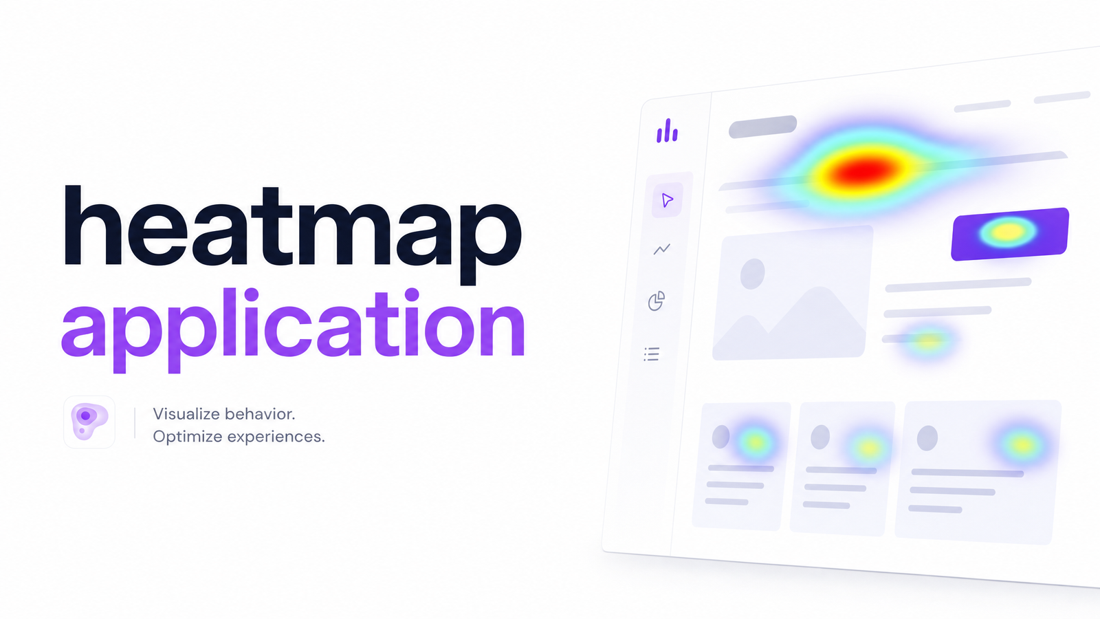
A heatmap application records how visitors interact with a webpage — where they click, how far they scroll, where their cursor lingers — and turns that behavior data into a color-coded overlay on the page itself. Red or orange clusters mean high concentrations of activity; blue or green areas mean little to none. Instead of reading a spreadsheet of coordinates, you see a picture of your actual page and immediately spot which sections pull attention and which get ignored.
That's the core idea behind what is a heatmap: it converts anonymous, aggregated behavioral signals into something visual and intuitive, so anyone without a data background can spot patterns in seconds. Tools like Microsoft Clarity and Hotjar popularized this category by making it free or low-cost to add a tracking snippet and start generating maps within a day. But "showing a colorful overlay" and "helping you understand your site" are two very different bars to clear, which is where most buyer confusion starts.
The 3 Core Types: Click, Scroll, and Move Maps
Every heatmap application generates three distinct datasets, even if displayed under one dashboard. Knowing the difference matters because each answers a different question, and reading the wrong map leads to the wrong conclusion.
Click maps record every click or tap, including on elements that aren't actually clickable — a strong signal that users expect a button, link, or accordion where none exists. If your question is "are people trying to click something that doesn't work," check a click map.
Scroll maps show how far down the page visitors typically get before abandoning it, usually as a gradient from the top (100% of visitors) fading toward the bottom. Use this when you suspect your call-to-action or key content is buried below the fold and most traffic never reaches it.
Move maps, sometimes called hover maps, track cursor movement as a proxy for visual attention — research shows a strong, if imperfect, correlation between where people move their mouse and where they're looking, especially on desktop. A move/hover map helps you understand which sections draw the eye even without a click, such as testimonials, pricing tables, or hero images.
Together, click map vs scroll map vs move map coverage gives a fuller behavioral picture than any single view — but only if you're asking the right question of the right map.
5 Features to Check Before You Pick One
Comparison listicles tend to rank tools by brand recognition rather than function. A better approach is to run any heatmap software candidate through a short, vendor-agnostic checklist focused on how the data is captured and what you can do with it.
Live rendering vs. screenshot-based capture. Some tools render the heatmap directly on your live, current page; others snapshot a static screenshot and overlay data on top, which breaks the moment you update your layout, run an A/B test, or ship a redesign. Live rendering is the more reliable long-term choice.
Session volume limits and sampling. Free and entry-level tiers often cap sessions recorded per month or per page, which can silently skew maps toward whatever traffic hit the cap first. Check the actual sampling method, not just the headline number.
GDPR and PII masking. Any tool capturing click and cursor data needs to mask sensitive fields — form inputs, payment details, personal identifiers — by default, not as an opt-in afterthought. This is non-negotiable for EU-facing sites and increasingly expected everywhere.
Integration with session replay. A heatmap tells you where activity clustered; a linked session recording tells you what actually happened in that visit. The strongest heatmap software comparison criterion is whether the two are connected in one view, so you can jump from a red cluster straight to real playback.
Export and API access. If you want to combine heatmap output with your own analytics stack or feed it into another system, you need raw export or API access — not just a locked dashboard view. This matters especially once you're correlating behavior data with conversion or accessibility audits.
Run through this list before comparing pricing tiers, and you'll filter out the screenshot-based toys fast.
Where Heatmap Applications Stop Short
Here's the part most comparison articles skip: a heatmap application, no matter how well-built, only shows you where attention concentrated. It doesn't tell you why users clicked a dead zone repeatedly (a rage click pattern that usually signals a broken or confusing element), why they abandoned the page at 40% scroll depth, or what specific change would fix either problem.
This is the central heatmap limitation vendor marketing glosses over. Heatmap data analysis, done manually, means staring at a red cluster and guessing — is the copy unclear, is the button not visually distinct enough, is there an accessibility barrier like poor color contrast, is the page just too slow to load past that section? A heatmap application is a behavior analytics tool, not a diagnostic one. It surfaces the symptom; it doesn't run the differential.
Teams that stop at the heatmap stage often end up with a wall of colorful screenshots and no clear next action — which is precisely the gap covered in Analytics for UX: Turning Behavior Data Into Fixes.
Turning Heatmap Data Into Actual Fixes
Closing that gap requires layering interpretation on top of visualization — reading behavior signals alongside the UX, accessibility, and performance issues that likely caused them. This is where an AI website audit adds the piece a heatmap can't: instead of just showing that users abandon a section, it checks that section for slow load time, poor contrast, missing alt text, or layout shifts, and connects the dots automatically.
Optimevra's AI audit is built around exactly this bridge. Rather than leaving you to fix conversion issues by eyeballing red clusters, it scans your site for the underlying UX, accessibility, and performance faults that heatmap-visible behavior is usually a symptom of, then produces a prioritized fix list — ranked by impact, not just flagged as "worth a look." For teams that also want a structured, repeatable process for reviewing a page beyond just heatmap data, How to Run a UX Audit Website Owners Can Actually Use walks through the full workflow, and Analytics and User Experience: How They Work Together covers how heatmap output fits alongside your other analytics signals rather than replacing them.
A heatmap answers "where." Fixing what's actually costing you conversions requires the "why" and the "what to do next" — and that's the layer worth adding once you've seen where attention goes. See it in action with a live demo, or check pricing to weigh the cost of an AI-powered audit layer against what a red-and-blue overlay alone is currently telling you. Start at Optimevra.
Frequently Asked Questions
Is a heatmap application the same thing as Google Analytics?
No — a heatmap application visualizes on-page behavior like clicks, scrolls, and cursor movement for individual pages, while Google Analytics tracks site-wide metrics like traffic sources, sessions, and conversions across your whole funnel. They work best together: analytics tells you which pages have a problem, and a heatmap tool shows you where on that page users are struggling.
How much traffic do I need before a heatmap application gives useful data?
Most heatmap tools need at least a few hundred sessions per page before patterns become statistically meaningful rather than noise from a handful of visitors. Low-traffic pages will show sparse, unreliable maps, so prioritize your highest-traffic landing or product pages first.
Do heatmap applications slow down my website?
A well-built heatmap tool adds a lightweight tracking script that loads asynchronously and shouldn't meaningfully affect page speed, but poorly optimized or bloated scripts can add measurable delay. Check a vendor's documented script size and loading method, and test your site's speed before and after installation to confirm there's no regression.
Can a heatmap application tell me why users are leaving, not just where they click?
Not on its own — a heatmap shows where attention or activity concentrated, but it can't explain the underlying cause, whether that's a UX problem, an accessibility barrier, or a performance issue like slow load time. Diagnosing the "why" typically requires pairing heatmap data with session replay, user feedback, or an AI-driven audit that checks the page for the faults actually causing the behavior.
Are heatmap tools GDPR-compliant to use on an EU-facing site?
Compliance depends on the specific tool's configuration, not the category as a whole — reputable heatmap software masks personally identifiable information like form fields and payment data by default. Before deploying on an EU-facing site, confirm the vendor offers PII masking, a clear data retention policy, and a documented legal basis for processing behavioral data.
What's the difference between a click map, scroll map, and move map?
A click map shows where users click or tap, including on non-interactive elements that visitors mistakenly expect to be clickable. A scroll map shows how far down a page visitors typically reach before leaving, and a move or hover map tracks cursor movement as a proxy for visual attention. Each answers a different behavioral question, so the right one depends on whether you're diagnosing broken interactions, buried content, or attention patterns.
Originally published on Rankevra.